Hello cats and kittens and sports fans of all ages! It’s once again that dreaded day of the week, known as #techdaddythursday™ Sponsored by @EroticonUK The best conference for erotic creatives Remember Eroticon, it’s better when you come.
Today’s topic was thoughtfully provided by @onqueerstreet Titled “Eleventy-two mistakes that make one’s website very not-user-friendly and how to fix them”
We need to start off with some initial assumptions before we hit the nitty gritty of what to change and how.
A) People are stupid. No this isn’t an insult and it applies to me as well as everyone else. What you think is obvious and right in front of their nose, isn’t
2) People are lazy. Like, seriously amazingly stupifyingly lazy. For example I asked both of the step children how they went to websites, and the answer was they googled it every time because it was easier that remembering the url.
<@>) People have really short memories. You can write a brilliant post that gets lots of views and people will forget what you wrote and when you wrote it so much quicker than you will.
Groundwork
Now that we have laid the groundwork we can start to look at the things you can do to lower the bar of entry to your website to make it user friendly while remembering that the bar really needs to be below ground level. Let’s start with your home page. Now your homepage is extremely important as it is the face of your site to NEW readers, and the thing we most want from NEW readers is to make them into regular readers and subscribers. So go and look at your home page. Does it tell people what they can expect? Is it easy to read? Can people find the content they might be interested in? Or is it a jumble of content that makes it hard to get an overview?
Let’s start with the real basics, Font, Color and Layout Is the font a web standard that looks the same in all web browsers? Is it a font that is easy to read on a phone and a 42inch monitor? Have you made wise color choice for ease of viewing or does it look like this?
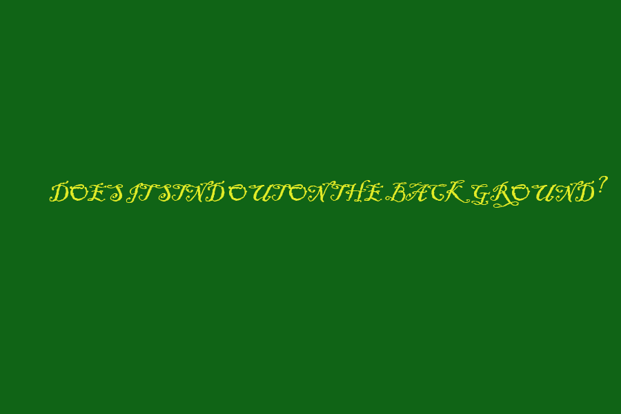
Imagine trying to read a whole blog post written like that. While this is not a real example it is much like ones I have had clients suggest. And even though they are paying me I do my damnedest to try and talk them out of it
About
After you have made sure your home page has a nice clean design with an easy to read font and background we move on to (bum bum buuuuum) content navigation
What is the purpose of your website and where do you tell people that? Molly and I always suggest a well written about page. It in one of the first things we do while compiling the Top 100 Sex Blogs list. She even wrote a post about, about 😉 What about you?
Categories
Now onto how you organize access to your content. If you have a lot of content like Molly do you have it all categorized so that it is easy to find all of the things like Sinful Sunday posts Masturbation Monday posts Wicked Wednesday posts and beyond memes, all the different topics you cover? That is what Archives and Categories are for. By the way, please make these dropd own menus to save valuable real estate on your posts and pages. And while those things are good, always make sure that your site has a link to ALL of your blog posts so that I can see all the things you have written in one place, because if I can ONLY see categories I might not be bright enough to guess that you put that post under BDSM when I think it is DDlg.
What’s on the menu
Next we move to your menus, and some people chose to use this space to list their categories and that is an absolutely fine way to go. The best part about wordpress and categories is that the software automatically creates a category page when you create a category, so all you have to do is go to appearance>>menu>>category link and add it to the menu and you are all done and all future posts in that category will appear on that page with no effort to you.
A Sidebar
Now have a look at your sidebar (this can be complicated since theme offer different variations) This is an extremely important space. It gives you a change to catch someones eye with something they might have not noticed. This is a good place for social media links, related posts, subscription forms (you do have that setup right?) Maybe a Twitter or Instagram feed. This helps you keep a reader engaged and on your website and gives them a chance to convert from a one time visitor to a subscribed and engaged reader.
There are many tools and plugins that can help you with reader engagement but we have covered most of the big things. So I will close with this. Look at the site your read regularly and find yourself spending time on.
Think about why that is and how you can add that to your site. Visit your site home page all the time. I know you think you know it, but you probably have forgotten exactly what it looks like and how it works. I visit the clients homepage that I do work for at least once a week so I am the first to know when something doesn’t work. You should do at least that for yourself. And when a visitor tells you something wrong or they can’t figure how to find something LISTEN!
Well enough of me wasting a perfectly good Thursday afternoon with my rubbish. Back to the fun and frivolity of a lazy Summer day until the next #techdaddythursday™
Eroticon Technical Director